
(Musical)
Pitch
ƥ
≈
(Lumia)
Kleurnaam
Ҡ
The Quest to Map Musical Pitch to (Visual Music) Lumia Kleurnaam.
Consideration & Rational
There exist among Lumia (visual-music) practitioners (especially those with an academic musical training) a strong desire for some sort of regular mapping of pitch to colours. The possibility of such a mystical alignment, romantic as it maybe, is somewhat irrational given the fundamentally different qualities of light versus sound, thence the way our brains receive and process such input (see “Electro-Magnetic Waves of Colour ≠ Compression Waves of Sound” below,†). However all that aside for those people dreaming of collaborative futuristic real-time performances of colour-music, the familiar everyday musical performance for participants and instruments alike provides the most robust metaphor thence effective path forward to for-filling such dreams. So freed from mystical delusions but enamoured by a solid ergonomic justification let this quest being.
ƥ Dasheißt,
Tonhöhe einer musikalischen Note, NICHT die Farbe der 'Kohle
Teer-Pitch'
{ English = That
is, pitch of a musical note, NOT the colour of the 'coal-tar
pitch' }.
Ҡ Kleurnaam is the Dutch word for ‘ colour name’ adopted here as the visual music semantic equivalent of pitch.
Background
Before going too much more it must be noted that, many ways for the mapping of sound qualities to visuals have been suggested over time. (Explored by Fred Collopy on his Rhythmic Light web-site. [ http://rhythmiclight.com/archives/ideas/correspondences.html] ). Any, if not multiple choices of the mapping, when successfully married to the more obvious specific task like; the teaching, or analysis, or visualization, of aural-music, may prove to be very effective at highlighting aspects of the aural-music that would not be so readily comprehended without such visual aids. All those tantalising possibilities aside these pages will focus on the colouring of pitch as that appears to be the most efficient route for ratcheting-up performers' prior life experience to the novel challenge of cooperating/ collaborating for a Lumia performance.
Historically
the traditional artist subtractive (pigment mixing) colour wheels
where constructed around 12 main colours, thus conveniently
matching the number of pitches per octave of western scales. This
coincident was viewed as some mystical justification for equating
of vision and sound, and thus a logical mapping of one to the
other.
[
http://rhythmiclight.com/archives/ideas/colorscales.html
]
Unfortunately due to the limitations of pigment sources enshrined in painter's colour wheels, traditional painter's colours are at best only a caricature of what the human eye can perceive or modern technology deliver. Sadly also for the romantics the quirks of human colour perception does not form a regular solid. Thus the simplistic mapping of 12 subtractive hues to 12 pitches works at most only for a couple of octaves around middle C. Even then it has irregular jumps between what are meant to be neighbouring colours. { This can be readily verified by reducing colour images of such colour scales to just a black & white image! }.
Initial Strategy
Colour selection and Pitch selection should be limited to what the average human can differentiate. In daylight to a trained eye there are about ten million distinguishable surface colours. Note that was “differentiate” not “perceive” because while the pitch like colour is a continuum we are concerned with what an average person would recognise in isolation as differing from a previous example. By that it is meant that we are not considering side by side comparisons to two colours to determine a match thereby “perceiving” some (often minuscule) difference / divergence between the candidates being directly compared, but rather such a situation where the observer is presented with a sequential display of one colour followed by another until the observers nominates that some colour has been repeated, so indicating that as far as they are able to “differentiate” in this scenario those two colours are recalled by the observes mind as being equivalent, despite in all like-hood that said two colour samples would not be judged as identical in any direct matching exercise.
With industrial revolution's push for standardisation of terms used in industry the quagmire a colour names soon became an issue. In 1939 when the ISCC (“Inter-Society Color Council” the professional body in the USA responsible for such matters) published “Method of Designating Colors” ISCC-NBS had amassed 7,500 defined colour names used in various standards at that time. The seminal text (collecting and comparing the many previous attempts) was United States Department of Commerce's National Bureau of Standards (NBS) (now called the National Institute of Standards and Technology) effort published 1955; “The ISCC-NBS color names dictionary and the universal color language, NBS Circular 553” by Kenneth Low Kelly (1910-), Deane Brewster Judd (1900-1972), [soft-copy on web at http://babel.hathitrust.org/cgi/pt?id=uc1.b4253551] . Now just called “the NBS/ISCC Colour System” [ http://web.archive.org/web/20070310041237/http://www.anthus.com/Colors/NBS.html ] this name-space has 267 areas of commonly agreed distinct colour names defined via the Munsell Colour scheme [http://en.wikipedia.org/wiki/Munsell_color_system] of those colours that are reproducible within the gamut limitation of modern technology. With each colour area exhibiting a similarly significant (if not always actually consistent) jump to neighbouring colours. Included in that 267 (colour regions of NBS/ISCC system) are the five neutrals;- White, Light Grey, Medium Grey, Dark Grey, Black. Discarding those 5 neutrals we are left with 262 named colour regions for possible assigning to pitches.
Turning now to the audio side of this task, normal human hearing is reckoned to encompass those frequencies between 16Hz to 20,000Hz. These frequencies could be dissected into the various collections of pitches indicative of the wide variety of scales found in different cultures around the globe. But as the point of this exercise is to facilitate automatic translation of existing musical treasures into colour renderings, & /or the accompaniment by one or more colourist of existing (audio) musical composition it would be expedient to start with the modern piano's twelve-tone equal temperament as our minimum functional requirement.
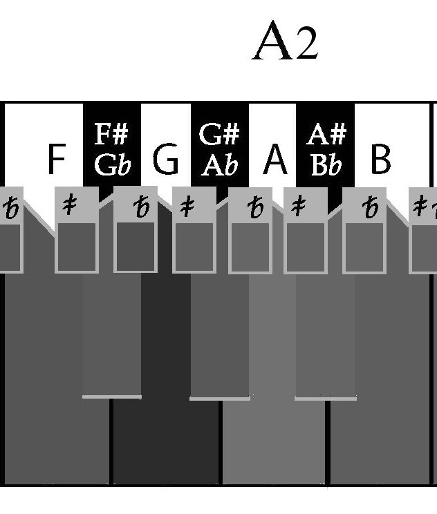
The standard modern grand piano has 88 keys running from A0 to C8, being from 25.8 Hz to a top of 4400Hz. Whereas human hearing range is from the B below C0 to D#10, a lot of extra keys historically over-looked and thus of scant relevance to our immediate task.
Before confining this quest to 88 keys of a piano, it is worth reflecting that in recent times the shortcoming of restricting pitch steps to semitones has become quite obvious. This is especially true when moving from; keyboards to other instruments, or to non-western musical traditions. Fortunately only the addition of quarter-tone steps appears to meet most concerns. That in mind for this mapping exercise the 87 quarter tones interleaved between standard 88 notes will also be considered.
Conceptual & Semantic Obstacles
Compression Waves of Sound ≠ Electro-Magnetic Waves of Colour †.
While any musician (ignoring the overtones of timbre) will recognise a sound-waves with a fundamental frequency of 440 Hz (hertz = cycles per second) as A4. Irrespective if that A-440 pitch is emanating from a finely crafted musical instrument in the context of a state opera-house, or a tinny transistor-radio in a subway it is still A-440. Source, context, signal strength does not alter the actual pitch nor the perceived identical pitch. However compared to single axis directness of sound the mechanics of colour is a counter-intuitive minefield, for colour is a three dimensional phenomena that evolution has wired our brain's vision centres to; interrupt, manipulate, fabricate or even concoct for our survival with minimal regard to actual stimuli reaching the eye. There is great PDF set of slide by Rolf G. Kuehni on the troublesome endeavour to define “Color Spaces” on the Web at http://www4.ncsu.edu/~rgkuehni/PDFs/ColSp.pdf
While the spectral colour “Red” with a frequency of 400–484 THz [terahertz: 1012Hz ] being a Wavelength of 620–750 nm [nanometre: 10-9m (a billionth of a meter)] is always the same when sunlight is passed through a glass prism, what the eye sees then the brain interrupts the colour to be may have no basis in the facts before the observer. † The colour of some object appears has to do with what mix of light waves that are adsorbed by the object along with which are reflected from the object's surface. This dramatically impacted by ambient lighting and observation context. While changes in production and observation context will impact the fidelity of a sounded pitch, such alteration (via normal circumstance in everyday experience) to fidelity of a sound do not (intrinsically) alter the actual pitch heard. But something as simple as the colour of neighbouring object, angle of lighting perceptually disrupt the actual perceived colour.
Hitches along the Quest.
So in this quest having 175 (88 + 87) pitches for aligning uniquely to 262 possible named-colour regions, there arose at this juncture some practical implementations obstacles requiring a major rethink. The issues of concern are;-
† Unlike pitch, changes in the output-signal strength actual result in different colours. In other words an increase in the amplitude of the single dimensional pitch does not alterer the pitch. Whereas an increase in the strength of a colour output-signal alters the inter-relationships of hue, value, chroma outputted thus a colour change (at least) in the technical sense if not also annoyingly obvious in the visual sense.
† The underpinning of the ISCC-NBS colour names dictionary thence the universal colour language are Munsell's hue, value, chroma classification of the light reflected off standardized colour swatches viewed under controlled lighting conditions. Viewed perpendicular when lighted at 45° from a sky-light facing North (in Northern Hemisphere), alternatively viewed from 45° when light-source is directly overhead. Yet the focus of our quest is a analogous grouping of named colour-spaces for colours as conceived to the artist irrespective of what actual colour's technically measurable characteristic are.
As with other areas of the visual music quest ( see “Vizsic Semantic Fusion” http://www.auzgnosis.com/pgs/perodic3.htm ) what we are endeavouring to do in mapping pitch to “colour” is adversely complicated by historical cross-talk between disciplines or practices of visual artists, musicians, dyers & paint technicians, without overlooking scientists & physicists.
Semantic Fusions & Clarification.
There now exists an urgent need for a new more specific technical word to separate the semantic confusion emanating from the differing technical and professional contexts that have spoken of “colour / color”. Everybody use the word “colour” to mean the same-thing as far as being a description of our perception of the light arriving at our eyes associated with some object we can see. The difficult in usage is one of scope thence import of the word's meaning across varying contexts. For centuries artisans & painters used a fairly (by their source materials) limited set of traditional names to designate their pigments. Such as;- Ochres from clay, Umbers from a dark brown clay containing oxides of iron and manganese, Carmine from carminic acid, Ultramarine from blue cubic mineral called lazurite, and the list goes on. The pigment's name being synonymous with the colour it imparted to an object so painted / dyed/ treated with. So (at least prior to the “Impressionist” at the end of the 18th century) for any observer the 'colour' of an object covered with say Cadmium Yellow, remained always Cadmium Yellow be that object illuminated by full sunlight, an overcast sky or candle light. But to a modern scientific observer a colorimetry measurement of said object under different illuminations would be noted as a diverse collection of 'colours'. So now in the context of visual music when speaking of a colour, do we mean a very specific combination of Red, Green, Blue settings or Hue, Chroma, Value levels? Or by using the word 'colour' are we instead thinking of a broad sweep of instrument readings / settings that would be associable with a common named colour concept like Ultramarine irrespective of the current illumination or signal / pigment strength in the immediate observation. Akin to how a modern painter can talk of pigments, the visual-music practitioner needs a special (unambiguous) word to designate this second sort of “broad sweep” colour concept.
My usual personal strategy in such situation is to leverage the strength of the English language for borrowing from other tongues, to see if I can find a suitable foreign word that may be re-purposed for the specialised task at hand. Translating from the English “Colour” = Farbe (German), Farba (Slovak ), kleur (Afrikaans & Dutch ), litur (Icelandic ), dath (Irish). Translating from the English the phrase “colour name” (English) = kleurnaam (Dutch ), Farbname (German). An alternatively solution strategy is to overload (in an unambiguous manner) an obscure word already confined to the discipline in question. Conveniently in the history of Visual Music there exist such an apparently suitable candidate, in the word “Lumia” as Fred Collopy notes on his web-page [ http://rhythmiclight.com/misc/naming.html ] “.... Lumia, which was used by Thomas Wilfred who wrote in 1965: "I am urging all of them to use the word Lumia for the art form itself, the word thus corresponding to Music for the art of sound.”” Thought I had the answer but unfortunately there is a hitch in some unfavourable close meanings;- “lum(s)” American Slang for cannabis from Colombia, “lum” Scottish noun for 'a chimney' {ORIGIN perhaps Old French lum ‘light’}, then the Armenian “lumay” small coin, (from Syriac “lumā”) /monetary unit of, equal to one hundredth of a dram; “luma (pl. lumas)” [per www.askoxford.com] or “lum·ma” [per dictionary.reference.com].
With the “lumia” option looking thin for the moment, I am going with the Dutch combination options of “kleur” & “kleurnaam” as the most flexible.
Further Task Analysis.
If 262 named-colours is divided by 20 possible naming qualifiers for each colour in the NBS/ISCC system we get 13.1 rather than number of hues (15) thus demonstrating that we are not dealing with a equally rich regular colour space. {A fully populated regular colour solid would have had a total of 300 (15x20) named entities.} Assuming for the moment the colour-space is a regular solid 262 named-colours divide by 15 hues gives 17.466´ which is less than 24 named-colours needed for each of our octaves if there is to be no drift of hue over the whole pitch expanse. So it has to be conclude that no matter what choices are made there will be some hue drift across the whole keyboard and a fair chance that someone's personal favourite colour will not be included in the final mapping of names of colours to pitches.
How and where to start the mapping from. Starting at the bottom means a lot of pastels will fall off the top. Starting at the top sacrifice a lot of dark colours at the bottom while also closing off any chance of adding visual octaves at the top of the keyboard.
Thus to decrease wholesale losses at either end of the mapping schema it seems logical to start in the middle. As pitch is only a two dimensional space, higher or lower, it is simple to pick a midpoint. C4 “Middle C” being taken as the beginning of the middle octave of our keyboard.
Unlike pitch, colour is a three dimensional space (hue, value, chroma) so ascribing a “middle” is a lot more problematic. The Munsell schema divides the colour wheel by five principal hues: Red, Yellow, Green, Blue, Purple (such normal ordering being an anti-clockwise rotation when colour-solid is viewed from above). Halfway between each principal hue is a secondary hue; red-yellow, yellow-green etc. With each primary and secondary hue being calibrated over a range from 1 to 10 the hue circle has 100 steps ( further measured to one decimal place). The fifth step of any hue being the most pure example. But to talk of a middle hue is nonsense as hue changes while moving around the colour wheel. So in the case of hue any will do as start point, to which one returns as you cycle up or down through the colour space via steps of 'value'.
For the 'value' dimension (tonal steps of a colour) the scale runs 1 to 9 for colours with 0=Black and 10 =White. Therefore the middle value is simply 5.
The possible chroma vary dramatically across the colour solid from chromas of 1 to 14 in the case of 5Y 8.5/14. (Typically 14 is the upper limit of chroma for cases of light reflected from a sample. However theoretically chroma rises up into the twenties for coloured light sources). So what is even the possible range of chroma will be confined by the choice of the starting hue. But as starting point is a critical landmark in the schema it would be best to be the strongest chroma available for the selected hue at value 5.
Let us not forget that by mapping (262) named-colours to (175) pitches, we lose the expressive potential of colour to present instrument / tone colour. We therefore need consider another full duplicate set colours varied by some 'fourth quality' that evokes an identical recollection of some given existing named-colour to pitch. Such a 'fourth quality' maybe a patina, a reflection index or visual texture. So for a piano there would be one set of mappings augmented by our mythical 'fourth quality', then for say a harpsichord a different set of mappings created with another setting of the 'fourth quality'. Further then alteration of the 'fourth quality' could then allow representation of instruments like a glockenspiel.
The majority of historical hue to pitch mapping follow Sir Isaac Newton's precedent of mapping “C” as a pure Red, then for the next tone higher “D” has Orange, followed by “E” as Yellow. Red for C4 is as good an arbitrary match as any other, then continue to rotate around the colour wheel in the same direction of hues ( Red, Orange, Yellow). But which of the many things called Red should be set as C4. For the pitch C4 we then need to find the NBS/ISCC named-colour which has the maximum chroma for the hue closest to 5R, at value 5 in the Munsell lingo.
Centroids & “Kleur / Kleurnaam”.
In Kelly & Judd's trail-blazing effort “The ISCC-NBS color names dictionary and the universal color language, NBS Circular 553” every individual colour-name space is a region over some span of Munsell colour notations, that in-turn can be construed as multiple tightly specified colours, so closely packed as arguable just a natural variation of some common pigment. So as any given colour-name space is not totally encompassed by a single colour notation scientist have taken to representing a whole region by the specific colour found at the centre of the region, or what the literature terms as the 'color centroid' of the given colour-name space.
In the case of our visual-music mapping task this centroids technique is troublesome. Not in that we earnestly yearn to use colours other than 'color centroid' to represent a given colour-name region, but rather that the often fractional rendering of the Munsell notations (resulting from calculation of a region's centroid) for many colours will be quite problematic to quickly ascertain then allocation of the most appropriate position in our desired mapping to pitch. So before allocating a kleur (recalling that we are using this term for the visual-music practitioner / lumianist as a designation of a broad sweep of colour, in the same fashion as a painter would think of a pigment name) to some pitch, it maybe pragmatic to select other simpler colour coordinates (within the same region) as the representative rendition of the given kleur.
The Challenge. (remaining should you choose to accept).
The 267 Color Centroids of the NBS/ISCC standard (along with Munsell coordinates & R,G,B Hex values) are here http://tx4.us/nbs-iscc.htm Take care to use John Foster's corrected values (not the early red-shifted Mac values). While there is a simplistic sketching of the modifiers layout at http://web.archive.org/web/20070310041237/http://www.anthus.com/Colors/NBS.html for any serious mapping attempt refer to original printed variations for each hue as illustrated in Kelly & Judd's NBS Circular 553 “The ISCC-NBS color names dictionary and the universal color language” online at http://babel.hathitrust.org/cgi/pt?id=uc1.b4253551 . Additional online resource to select possible colour encoding of kleur's from are:-
http://www.december.com/html/spec/colorucl.html
http://www.december.com/html/spec/colorucl2.html which gives hexadecimal sRGB values for various (orderly sampled) Munsell notations sequenced and named in line with the NBS/ISCC standard. There is a great online tool for converting between colour models.
"RGB Chart & Multi Tool" http://www.perbang.dk/rgb/EE0000/
You enter any RGB hex encoding, press the grey "Go" button then you can scroll the
colour model list under the heading "Colour Conversion" select Munsell to find the relationship between your RGB and Munsell; Hue,Value,Chrome space. Lastly http://en.wikipedia.org/wiki/List_of_colors provides sRGB values and relevant hexadecimal encoding for common pigment names.So starting with pitch C4 we initially hoped to find the best Red in the NBS/ISCC named-colour space which has (in the Munsell lingo) the maximum Chroma for the Hue closest to 5R, at value 5.
Then once C4's kleur was allocated proceed as follows: Moving by quarter tone step up the pitch scale, allocate the next kleur by stepping through the colour solid to the next immediate neighbouring colour-name region. So as to repeat one whole cycle of the colour solid approximately every octave, ever spiralling to further hues in a warm to cool to warm again direction. Simultaneously zigzagging through chroma, as value trends ever higher & lighter. Taking care where possible to align the strongest examples of Primary & Secondary colours with the 'White keys' of a traditional piano layout. Other icon colours like Ultramarine, or Lemon can then be relegated to the 'Black keys' with the remaining more obscure colours being consumed via the quarter tones. Upon reaching the topmost pitch of the piano keyboard, then reverse the procedure by returning one's attention to C4 then descending down the keyboard (again by quarter tone pitch steps) trending now towards the cooler, darker, duller colours.
If one runs out of colour to select from, before reaching either end of the keyboard then you will have to return to your C4 kleur mapping and trace another spiral path through the colour solid in that direction.
As there are more colour-name regions in the NBS/ISCC named-colour space than kleurs to pitch required to be allocated, it is fairly likely that there potentially exist more than one solution path in / to this exercise. In the event of competing solution paths, test contending mapping by rendering as a Lumia test some direct sound to colour transposition of famous Baroque or Classical music pieces to see which of the contending path solutions provides the most pleasant rendering.
Lesson from Difficulties Thus-far Encountered.
Hunting for possible Reds as the Kleur for Middle C (C4), has brought to mind a possible fatal assumption with the strategy of starting with;- Pitch [C4] = Kleur [5Red 5/c?] then spiralling alternative up & down through the Munsell colour solid. As it assumes that there are enough NBS/ISCC named-colour-regions, in either direction to match all the Pitches in that direction. The Munsell colour solid is definitely not symmetrical, so it is very likely that there exist a bias to have more named regions in the lighter or darker colours. Thus before any Red can be assigned to Middle C the Centroids (being the calculated centre of each regions Cartesian space) of their respective NBS named colour regions need to be sorted from lowest Munsell value to highest Munsell value. The Value of a colour in the Munsell notation is the first number after the letters of the Hue. For example 6R 5/9 is the Munsell colour at; Hue = 6R, Value = 5, Chroma = 9. Once the value sort is done it maybe that C4 should actually be a Pink (high value Red) or a Brown (lower value Red), with typical Red at either C3 or C5.
Some of the NBS named colour regions are troubling large contorted things “vivid red” for example variously sprawls and weaves across 9 Hue steps, 6 Value steps 3+ Chroma steps as a seemingly catch-all bucket for any vibrant, luminous red things not seen or known in the 1930. Other than the NBS/ISCC 267 Color Centroids there are now many other on-line Colour Dictionaries providing researched &/or standardized codified name colours. Aubrey Jaffer's effort http://people.csail.mit.edu/jaffer/Color/Dictionaries (while a guest not a member of the MIT Computer Science and Artificial Intelligence Laboratory) is the best survey of these various offerings. The last few in Jaffer's listing following his discussion of “NBS/ISCC Centroids” may provide useful remedies for any short-coming flowing from our strategy to start with the “NBS/ISCC dictionary of universal colour language” as a foundation, during our quest for a robust user-friendly Pitch~Kleur mapping.
Recapping:
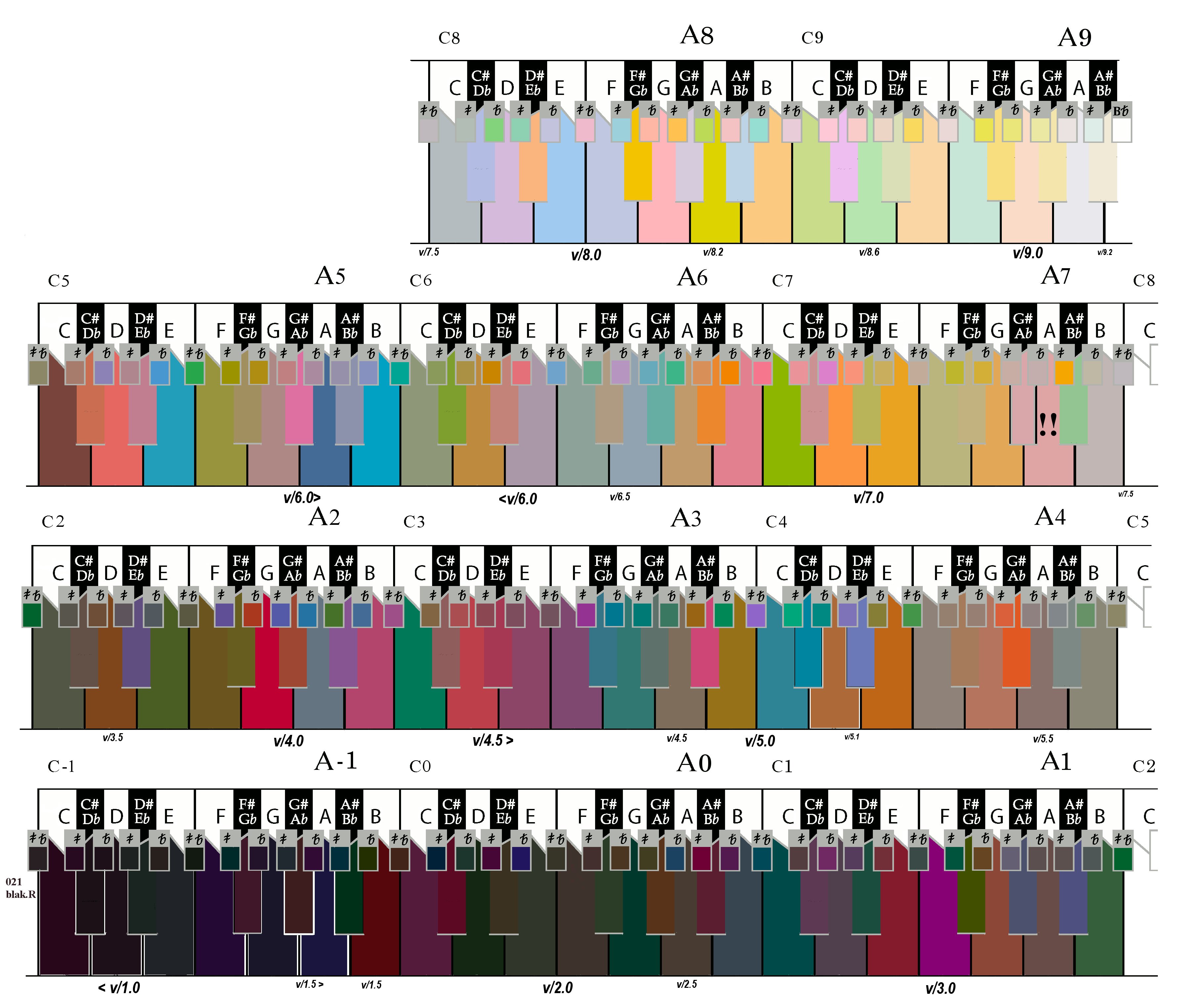
The standard modern grand piano has 88 keys from A0 to C8. With 87 quarter tones interleaved between standard 88 notes also being considered we have a minimum of 175 candidate pitches they may be worth mapping to Kleurs. As instruments traditionally used in performance of (Arabic & Eastern) music featuring quarter tones do not seem to have as deep a rang as Western traditions there maybe justification in not including quarter tones through-out the whole base region. Human hearing ranges from B below C0 to D#10, extra keys historically ignored (thus of scant relevance to immediate task) but may be worth consideration is significant swath of usable unallocated NBS/ISCC Colours remain after more common pitch have been paired with a Kleur.
NBS/ISCC Colour System” this name-space has 267. Discarding the five neutrals [White, Light Grey, Medium Grey, Dark Grey, Black] we are left with 262 named colour regions for possible assigning to pitches. Thus 262 possible named-colour regions, for aligning uniquely with 175 (88 + 87) pitches.
Or as some future proofing the larger 102 keyboard:
Stuart &
Sons Handcrafted Grand Pianos
http://www.stuartandsons.com/index.php?option=com_content&view=article&id=69&Itemid=76
The
maximum practical frequency range for the acoustic piano is 102
keys CCC (16.3516Hz) to f5 (5587.6517Hz @ A 440.00Hz). It was
inconceivable to limit these new generation pianos to the 88 keys
of the standard 19th century piano.
Key
№1
= A0 on a Traditionally
Grand-Piano
up-to Key №88
= C8, that being 7.25 octaves.
For
8.5 octaves reach of 102 keys extra notes must be added at both
the ends (for if first key remained at A0 the top note would go to
D9 well past the practical range for an acoustic piano). So Stuart
& Sons start
the keyboard at a 16.3516Hz
C0
rising to a F8 (5587.6517Hz
@ A 440.00Hz)
Thus
when quarter-tones are included we have 102+101 = 203.
96
notes below middle C, middle C itself, then 106 above.
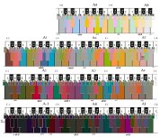
 [complete
full-scale image here]
[complete
full-scale image here]
Cultures to which quarter-tones are musically most relevant;- North African, Central and Asian Minor use musical scales strongly linked to the pitch range of the human voice. Such that musical instruments are not expected to be performing pitches much outside the range of the human voice. “In terms of frequency, human voices are roughly in the range of 80 Hz to 1100 Hz (that is, E2 to C6) for normal male and female voices together.” [http://en.wikipedia.org/wiki/Vocal_range] So for our purposes the 24 quarter-tone pitches below C2 along with the 17 quarter-tone pitches above C7, may optional be ignored should the available, remain unallocated number of “NBS/ISCC colour name regions” be less than pitches yet to be associated with a Kleur, or such further addition would unacceptable distort some pattern or logic that comes to characterise the Pitch to Kleur selection in the central most used octaves {C3 to C6}; such as Reddish Kleur around C pitches.
So if one where to select Strong Red 4R4.4/12.1 ( NBS/ISCC № 12) as the C4-Kleur, then there would be 94 remaining NBS/ISCC Centroids of the same or higher Munsell Value to map to 106 (maximum considered pitches) –17( ignored top end quarter-tone) = 89 pitches. Like-wise working down the colour solid there are 167 darker NBS/ISCC Centroids that are darker than the 4.4 Value for Strong Red but even if you where to fully populate all the quarter-tones that only makes 96 pitches you need to select a Kluer for. If you had discarded the optional 24 quarter-tones pitches below C2, you would be left with 167 Centroids to fritter among a measly 72 pitches!
Given the above you may choose to map Strong Red 4R4.4/12.1 to a higher pitch like C5. Or a person could select a different darker red to be mapped to C4, else another hue altogether. From here on it becomes trial and error juggling games to reach some personally judged satisfactory result.
If a need is felt to prioritise pitch to be (similar feel) constituently mapped across octaves, then I suggest; first do the “White” notes, then “Black” notes in the order B♭, F♯, E♭, C♯, A♭, G♯, lastly the quarter-tones pitches such that the further from centre of the keyboard the less important.
Most important point last. Do Not Forget that the Centroids coordinates are at the notional middle of any given “NBS/ISCC colour name regions” spacial volume. As some regions span multiple Value, Hue, Chroma increments the quester is free to choose another colour (of a know location within a region) as a Kluer for a particular Pitch, so long as Value of the Kluer is logical in relationship to the Value of neighbouring pitches and no other colour has already been, or is intended to be selected from that same region for some other pitch. Any NBS/ISCC colour name region may only be associated with one pitch. So that each pitches' Kleur be that the Centroid within a region, or some-other colour from a region has an unique NBS/ISCC colour name.
Tricks, Strategies & Heuristics.
Paying particular attention to above points; 2, 5, 12, 27, 13, 23, 26, 17.
Original Outlined Concept:
Was simplistic conceived as select a suitable red as the kleur for C4, then spiral up and down through the colour solid. Full details outlined above under the headings; Initial Strategy, Further Task Analysis. Along with extra points 14 to17.Centroids in Value Order from an End:
The quick lazy extreme, without any consideration of hue. Following Lesson from Difficulties Thus-far Encountered [heading above] NBS/ISCC Centroid are sorted by Munsell Value. When Value is sorted in Ascending order associate with pitch starting from the lowest note. Alternatively when Value is sorted in Descending order associate with pitch starting from highest note. The most glaring failure of this sloppy strategy is the utter lack of any sense of logic in choice of neighbouring hue, or correlation from one octave to the next.New Tact after Newton:
The NBS/ISCC colour name regions are ordered maximum Value by maximum Chroma to minimum of each within an uninterrupted segment of Hue. The like numbered Centroid is for same region, but the Munsell coordinates of the Centroid (by definition) will not closely reflect the same Value & Chroma relativities as their regions top most outside extremity. Once having reached the lowest Value Chroma couplet within one vertical segment the Hues, the cycle starts all over again at the maximum Value & Chroma for next hue. Munsell Hue order (anti-clockwise around the colour solid viewed from above) is; Red, Yellow, Green, Blue, Purple then back to Red. Unfortunately as Hue is signified by non alphabetically ordered letters. So sorting Hue is not as simple as sorting the numeric variables of Value & Chroma. But as the NBS/ISCC regions alike their centroids are sequenced in the same Hue direction, on a vertical slice by next vertical segment level of comprehension then NBS/ISCC colour name sequence number is a fairly good stand-in for the Hue order. Fortunately this same Red, Yellow, Green, Blue … ordering of Hues is the one historically favoured by the overwhelming majority of investigators dreaming of correlations between colour and musical pitch. So now following the above Centroids in Value Order from an End strategy with due attention to the NBS/ISCC sequences numbers some semblance of logic in selection of Hue can also be achieved.Regions in Bottom Value Order from Lowest Pitch:
Recalling that colour regions in the NBS/ISCC system come in a wide variety of shapes & sizes with the centroids being the mid-point of a colour region that may rise quite a distance along the Value scale. So spiralling up through colour solid from the bottom along the Value axis, centroids are no indicator of the order new regions are encountered. Rather colour location closer to the bottom of each named colour region are needed. So while the base of any region is quickly read from the definition charts for said region that Value is quite problematic for the task at hand. For (with the exception of regions on the lower-half of the colour-space's surface) the Value at the base marks the Value threshold between vertical touching spots of adjacent regions. No what is actually required is the Munsell Value of a quester selected colour a little way (at least a half step of Hue, Value, Chroma) from any edge boundary of the region. [NOTE: Tools to aid such colour selection have already been discussed in point 13 above.] If also sequenced by NBS/ISCC within each band of Values being considered the resulting Kleurs should roughly mimic the historically desired flow of Hue as it cycles along the pitch space. But unfortunately as the colour solid is irregular in shape it is very unlikely that such a cycling of Hues will neatly repeat by octave.
 [full
scale of original image here]
[full
scale of original image here]
Regions in Descending Value Order from Highest Pitch:
The much the same as the immediately previous Regions in Bottom Value Order from Lowest Pitch but sorting of Hue will not be as convenient nor obvious.Value Slice per Octave:
Excluding the Original Outlined Concept all other strategies starting as they do from one or other ends of the keyboard will exhibit problem with inclusion of colours of no particular standing at the starting end while simultaneous risking notable colours failing to make the cut at the opposite end of the keyboard. [That is point 6 above again]. Additionally because of the irregular shaped colour solid it is very unlikely that the cycling of Hues will neatly repeat by octave. So to get a better correspondence between pitch octaves with steps of Value the task could be broken down as a series of smaller chunks of an octave or so of pitches at a time against a subset of the colours. Working with longer keyboard from C0 to F8 you have little over eight octaves of pitches address. [As noted in point 13 above] Kelly & Judd's NBS Circular 553 “The ISCC-NBS color names dictionary and the universal color language” online at http://babel.hathitrust.org/cgi/pt?id=uc1.b4253551 from that there are seven constant Value slices. These constant Value slices conveys all the required detail to make sense of the solid in the least number of charts, but for this task it would advisable to nut out some more slices at other Value marks (at a minimum) like 5,6& 7. Some whole Value increments (especially 2 & 8) are also the boundary layer for particular colours, like at Value 2 there is the boundary between "blackish Blue" below "dark greyish Blue" above. Obvious where such a boundary exist there is no colour-name space from which you may select a colour of that value in that patch! Reiterating previous comments above what is actual required is the Munsell Value of a quester selected colour a little way at least a half step of Hue, Value, Chroma from any edge boundary of the region, tools to aid such colour selection have already been discussed in point 13.Red Targeted Nodes:
As successful as the previous Value Slice per Octave strategy may prove to be it does not guarantee an octave on octave alignment of Hues, but then again in the final wash-up that goal maybe just a dream. However one trick that could provide the desired outcome would be to examine the vertical Hue segment charts from Kelly & Judd's NBS Circular 553 “The ISCC-NBS color names dictionary and the universal color language” [online http://babel.hathitrust.org/cgi/pt?id=uc1.b4253551 ] Once deciding which Hue segment one wishes to align with a particular note in the scale go to that vertical Hue segment seeking to identify and or select a named colour space for each occurrence of the note across the whole extent of the keyboard. So as an example the second such chart in ISCC-NBS Circular 553 is for Hues 4R~6R showing 26 colour name regions. Recalling [as expounded in point 8 above] the fifth step of any Hue being the most pure example of that Hue, this particular segment allows the quester to lock in a correlation between Red and all the various octave steps of the pitch C along the keyboard. So by assigning one of the three lowest red colours as the Kleur for C0 there exist an anchor from which to start the quest. Then a Kleur for C8 the three highest red colours are available choices. After that the quester could select the strongest Chroma half up the Value axis as C4 and so on until each C has it own unique Kleur. With all the C pitches now assigned to an appropriate Kleur the quester may choose to free-wheel around common Value slices from one C to the next C. Alternatively the same exercise as was just done for Red could be undertaken at some other of the Hues like halfway further round the Hue circle at blue-Green 10BG-9B for the F pitches.Something Else:
In all probability final solution may be some combination of the above strategies or something all together different. There are no wrong answers only more or less successful solutions.
|
|
![]()
This
Site is constantly evolving, so please forward comments
or
questions regarding this site to
webmaster:
©
Copyright 2010 ~2021 W’Shawn
Gray, All
rights reserved
Use
of this web site and content from it is subject to our Legal
Notice and Disclaimer
Site created AuzGnosis P/L